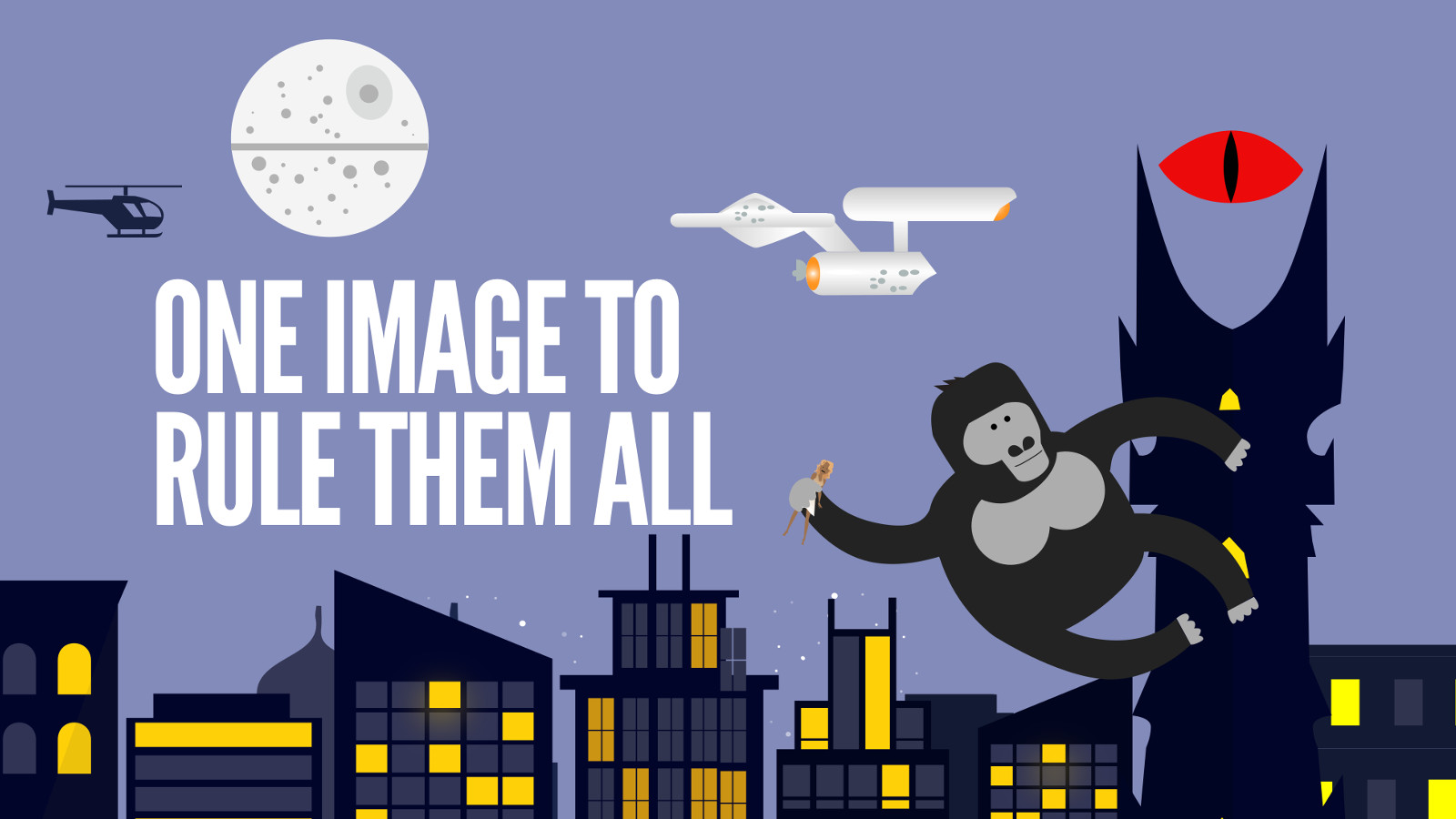
Have you ever wondered why your images don’t look right on social? How it always seems that there’s a different social image size for every single social property? And how, even though you follow their published guidelines, your images still look a little off? Wonder no more—this is the second post I’ve made to give you One Social Image to Rule Them All.
It’s been a while since I wrote the original post and like all things on social media the dimensions have drastically shifted. In the past, the image cropping between the “Big Three” platforms of Facebook, Twitter and LinkedIn was pretty drastic. Now, they have all shifted to adopt a 16:9 horizontal image… Or at least that’s what they’ve told us!
I’ll show you that it’s more like 16:9ish and give you a couple of guidelines to make sure that your images pop without looking silly. I’ll also challenge my friends at Facebook, Twitter and LinkedIn to update how the display images, especially in their metadata to really adhere to the ratio they’ve published.
How I Stumbled On the Problem
It’s no secret that having a border is a way to make images on social media pop. In fact, we did this quite well for our #moretime campaign at Rackspace. Check out how the image looks in a feed with a small red border—it’s just enough to set the image apart from the rest of the feed:

It was successful that I decided to add a border for a personal project with my SA Flavor blog for the Twitter chat with the hashtag #satxchat. Here’s how it looks below:

I noticed that when I did a Photo post on Twitter and Facebook the graphic was rendered just fine. However, I started having cropping problems when I used that same image as the Featured Image for a blog recap and it was passed to the social platforms via the metadata. This got me to thinking and made me realize it was time to crunch the numbers to find another social media image size to rule them all! First, let’s see how the above image looks on each platform:
You’ll see when you share the photo as a Photo post it looks fine. However, you’ll notice that the top and bottom border is cropped out when a link is shared with the photo as the featured image, leaving an “odd” looking left and right border.

Again, we have a perfectly fine photo when shared as a Photo post and that top/bottom border is cropped out when the photo is used as a featured image in a blog and the link is shared.

LinkedIn has equal funkiness as both the Photo post (it crops out the left and right border) and the metadata post (it crops out the same top and bottom border as Facebook and Twitter). So neither option adheres to the 16:9 ratio.

While this may not seem like a big deal to the “casual” observer, this is a big deal to people who pay attention to the details. A sloppy image/border on the image can leave a less-than-desired experience for users. The devil is indeed in the details and when you want to present a professional/sharp design to the market, you want it to look spot on.
Solving for the Bunch of “Crop”
So what’s the best way to solve for this issue? This depends on whether you know how the image will be used.
- Create your image with a 16:9 ratio—to ensure it looks good on retina, create it at 1600px by 900px
- If you’re only ever going to share the image as a Photo post in Twitter and Facebook, then I’d advise using a border to set it off in the feed
- If you may use that same image as the Featured Image in a blog post, I’d advise not putting a border on it because it will look wonky when the link is shared on social
- Additionally, if you’re going to use the same image as the Featured Image in a blog post, you should allow for a 4% padding on the top and bottom of the image for “non-essential” elements (this would be 65px if you use the ratio advised in the first bullet); note that this would probably happen any way as most designers wouldn’t crowd the top and bottom border
- Finally, if you’re going to use the image as a Photo post in LinkedIn, allow for a 8% padding on the left and right for the crop that happens in the platform (this would be 130 pixels if you use the suggested dimensions in the first bullet)
If those are too many options and you are looking for a clear-cut rule to give your designers to make sure that the image will pop every time, tell them the following: 1600px by 900px, never use a border, allow a padding on top/bottom of 65px and left/right of 130px.
Examples of the 16:9 “borderless” image with padding
So if you’re curious about how everything would look with an image that follows the “clear-cut” rule, check out how the revised One Image to Rule Them All that’s sized at 1600px by 900px without a border and the associated padding.
This is what the original image looks like:

This is what it would look like on Twitter:

On Facebook:

And on LinkedIn:

Challenge to All my Friends and Reps at the Platforms
First off, thanks so much for converging towards this 16:9 ratio for images. This has dramatically helped all of us social marketers with having more of a standard image to use across your platforms. But it’s time to make one last tweak to really help us out!
I want to challenge you all to work with your product teams to truly adopt the 16:9 ratio, both for photo posts and when popping the metadata on link posts. This will allow us to have a singular standard to give our design teams where we can focus on the content and what image does the best to tell our story rather than splitting hairs on a handful of pixels.
Follow Garrett on Twitter at @pinojo and sign up to the Marketing Bytes newsletter here!


7 thoughts on “Social Image Size Specs to Rule Them All”
I’ve been using Sprout Social to post images to social media, and I noticed that they look just fine on LinkedIn and Twitter when viewed on a desktop, but on the mobile apps for both platforms, they’re cropped much tighter than intended, and the only way you can see the full photo is by clicking on it, which expands it. Is there a way to avoid this? I don’t want people to have to click to see the full image when viewing it on their phones.
Thanks for the comment Brittany. Just follow these guidelines and it should work on mobile just fine; that’s one of the reasons that I put together this guide. I got sick of the same thing!
Just want to say thank you for saving me bunch of work. I’m a graphic designer and was just about to do some calculations myself. Then a google search brought me here.
I also need to make Instagram posts, but those I’m guessing will always be 1:1? Also, any other suggestions for Pinterest?
Awesome! Instagram now allows both landscape and portrait, so this should theoretically work. However, it also should be noted that honoring that 1:1 may be best to make it seem “less market-y.” I believe you can do horizontal in Pinterest now as well, though again, you might be better served do vertical pins. Good luck!
Hi Garrett,
Great article, very helpful. I was just curious, when you say padding of 65px (for example) would that be 65px on BOTH the top and bottom or 32.5px for each?
Thanks for the comment Jack—to be clear: 65px on the top, 65px on the bottom.